
Mastering the Craft: 25 Essential UX Pro Tips for Designers
User experience (UX) design is a constantly evolving field that requires a deep understanding of user behavior and psychology. As a designer, you’re tasked with creating digital experiences that not only look great but work seamlessly. With the ever-increasing importance of digital experiences in our daily lives, it’s imperative that designers stay on top of their game. In this post, we’ve compiled a list of 25 UX pro tips for designers that will help you master the craft of modern design. From the basics of user research and wireframing to more advanced techniques like micro-interactions and animation, this comprehensive guide will offer valuable insights and actionable advice for designers at any level. Whether you’re a beginner or an experienced designer looking to take your skills to the next level, this post is for you!

Here is our list of 25 Top UX Practices each frontend designer ought to follow:
1. Introduction: The importance of User Experience (UX) in design
In today’s fast-paced digital world, where attention spans are shrinking and competition is fierce, the importance of user experience (UX) in design cannot be overstated. UX encompasses every aspect of a user’s interaction with a product or service, from the moment they first encounter it to the final stages of their journey.

A well-designed user experience takes into account the needs, wants, and expectations of the user, ensuring that every interaction is seamless, intuitive, and enjoyable. It goes beyond aesthetics to focus on the functionality, usability, and overall satisfaction of the end user. From websites to mobile apps, from software interfaces to physical products, a great UX can make all the difference in capturing and retaining users.
Why is UX so crucial? Simply put, it directly impacts how users perceive and engage with a brand. A positive user experience builds trust, establishes credibility, and fosters loyalty. On the other hand, a poor UX can lead to frustration, confusion, and ultimately, user abandonment.
Moreover, a well-crafted user experience can also have significant business implications. It can drive customer acquisition and conversion rates, increase customer retention, and ultimately boost overall sales and revenue. By prioritizing user experience in design, businesses can differentiate themselves from competitors, create meaningful connections with their audience, and deliver products and services that truly resonate.
In this comprehensive guide, we present 100 essential pro tips for designers to master the craft of user experience. From research and prototyping to usability testing and beyond, these tips will equip designers with the knowledge and skills necessary to create exceptional user experiences. So, let’s dive in and unlock the secrets to crafting remarkable UX that captivates and delights users.
2. Understanding the fundamentals of UX design
Understanding the fundamentals of UX design is crucial for any designer looking to master their craft. UX, which stands for User Experience, is all about creating designs that are intuitive, user-friendly, and enjoyable for the end-user.

At its core, UX design is about putting the user first and designing with their needs and goals in mind. This means taking into consideration factors such as ease of use, accessibility, and the overall satisfaction that the user will derive from interacting with the product or website.
To truly understand the fundamentals of UX design, one must delve into the psychology of human behavior and how users interact with digital interfaces. This includes understanding concepts such as information architecture, usability principles, and user testing.
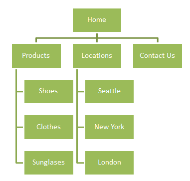
Information architecture involves organizing and structuring information in a way that is logical and easy to navigate. This includes creating clear navigation menus, intuitive labeling, and organizing content in a hierarchical manner.
Usability principles are guidelines that help designers create interfaces that are easy to use and understand. This includes concepts such as visibility of system status, user control and freedom, and error prevention. By incorporating these principles into their designs, designers can create a seamless and frustration-free user experience.
User testing is an essential part of the UX design process, as it allows designers to gather feedback and insights from real users. This can be done through various methods such as conducting interviews, creating prototypes for testing, or analyzing user behavior through analytics tools. By collecting and analyzing this data, designers can identify pain points and areas for improvement in their designs.
By mastering the fundamentals of UX design, designers can create designs that not only look visually appealing but also provide a delightful user experience. Understanding concepts such as information architecture, usability principles, and user testing will lay a strong foundation for designers to create intuitive and user-friendly designs that truly resonate with their audience.
3. Tips for conducting effective user research
Conducting effective user research is crucial for designing a successful user experience. It provides valuable insights into the needs, preferences, and behaviors of your target audience, allowing you to create intuitive and user-friendly designs.

Here are some tips to help you conduct user research effectively:
- Define your research goals: Clearly define what you want to achieve with your user research. Are you trying to identify pain points in your current design, understand user expectations, or validate new features? Having clear goals will help you stay focused and gather meaningful data.
- Choose the right research methods: Depending on your goals and resources, select the most appropriate research methods. This could include interviews, surveys, usability testing, card sorting, or diary studies. Each method has its own strengths and limitations, so choose wisely.
- Recruit representative participants: Ensure your research participants are representative of your target audience. Consider factors like age, gender, location, and relevant characteristics. Recruiting diverse participants will help you gather a broader range of insights.
- Create unbiased and open-ended questions: When conducting interviews or surveys, use open-ended questions to encourage participants to share their honest thoughts and experiences. Avoid leading questions that might influence their responses.
- Observe and listen actively: During usability testing or user interviews, actively observe and listen to participants. Pay attention to their actions, expressions, and verbal cues. Note any challenges they encounter or feedback they provide. This will help you identify areas for improvement.
- Analyze and synthesize data: Once you have collected the data, analyze and synthesize it to identify patterns, themes, and common pain points. Use tools like affinity diagrams or thematic analysis to organize your findings and extract key insights.
- Iterate and validate: Use the insights gained from user research to inform your design decisions. Iterate on your designs based on user feedback and test them again with users to validate whether the changes have addressed their needs.
Remember, user research should be an ongoing process throughout the design lifecycle. By consistently seeking user feedback and incorporating it into your designs, you can create products that truly resonate with your target audience and deliver exceptional user experiences.
4. Best practices for creating user personas
Creating user personas is a crucial step in designing user-centered experiences. User personas are fictional representations of your target audience, based on research and data, that help you understand their needs, goals, and behaviors. By creating accurate and detailed personas, designers can ensure that their designs align with the specific needs and preferences of their users.

To create effective user personas, start by conducting thorough user research. This can involve surveys, interviews, and analyzing existing data to gather insights about your target audience. Look for patterns, common traits, and behaviors that can inform the creation of personas.
When crafting personas, it’s important to make them relatable and human. Give each persona a name, age, occupation, and background information that reflects your target audience. Include details about their motivations, frustrations, and goals related to the product or service you are designing for.
To make user personas more impactful, consider using visuals such as photos or illustrations to bring them to life. This can help designers and stakeholders better empathize with the personas and understand their unique characteristics.
Lastly, remember that user personas should not be static. Regularly update and refine them as you gather more insights and feedback from users. This ensures that your personas accurately reflect the evolving needs and behaviors of your target audience.
By following these best practices for creating user personas, designers can make informed design decisions that prioritize user needs, resulting in more intuitive and user-friendly experiences.
5. Designing intuitive and user-friendly interfaces
Designing intuitive and user-friendly interfaces is essential for creating a positive user experience. As a designer, your goal should be to make it effortless for users to navigate and interact with your product or website.

Here are some expert tips to help you master this craft:
- Keep it simple: Avoid clutter and unnecessary elements. Focus on the core functionality and prioritize the most important features.
- Use clear and concise language: Use plain language and avoid technical jargon. Make sure your instructions and labels are easy to understand.
- Provide clear visual cues: Use visual elements such as icons, buttons, and colors to guide users and indicate interactive elements.
- Consistency is key: Maintain consistency in your design elements, such as typography, colors, and layout, throughout the interface. This helps users develop familiarity and reduces cognitive load.
- Utilize white space: Allow for sufficient white space between elements to create a clean and uncluttered interface. This improves readability and visual hierarchy.
- Prioritize usability over creativity: While aesthetics are important, usability should always take precedence. Ensure that your design choices enhance functionality and ease of use.
- Conduct user testing: Regularly test your interface with real users to identify any usability issues and gather feedback for improvements. This will help you validate your design decisions and iterate on your interface.
- Optimize for mobile devices: With the increasing use of smartphones and tablets, it is crucial to design interfaces that are responsive and user-friendly across different screen sizes.
Remember, the key is to put yourself in the users’ shoes and design with their needs and expectations in mind. By following these tips, you can create interfaces that are intuitive, user-friendly, and ultimately provide a delightful user experience.
6. The art of wireframing and prototyping
Wireframing and prototyping are essential steps in the UX design process. They allow designers to visualize and test their ideas before investing time and resources into the actual development phase.
Wireframes serve as a skeletal framework of the user interface, representing the basic structure and layout of a website or application. They are typically created using simple shapes and placeholders to outline the key elements and functionalities. This low-fidelity representation helps designers focus on the overall user experience and information hierarchy without getting caught up in visual details.
Prototyping, on the other hand, takes wireframes a step further by adding interactivity and functionality. It allows designers to simulate user interactions, transitions, and animations to get a more realistic feel of how the final product will behave. Prototypes can range from basic click-through models to more advanced interactive prototypes created with specialized tools.
By wireframing and prototyping, designers can effectively communicate their design concepts to stakeholders and gather valuable feedback early in the process. This iterative approach helps refine the user experience, identify potential usability issues, and make informed design decisions.
When wireframing and prototyping, it’s important to keep the end-user in mind. Focus on creating intuitive and user-friendly interfaces that align with your target audience’s needs and expectations. Consider factors such as information architecture, navigation, visual hierarchy, and interaction patterns to ensure a seamless and engaging user experience.
Remember, wireframing and prototyping are not one-time activities. As the design evolves, it’s crucial to continuously iterate and refine your prototypes based on user feedback and usability testing. This iterative process allows designers to validate their design choices and make necessary adjustments to create a polished and user-centered final product.
In summary, mastering the art of wireframing and prototyping is essential for designers to create successful user experiences. These techniques enable designers to test ideas, gather feedback, and refine their designs before moving into the development phase. By incorporating wireframing and prototyping into your design workflow, you can enhance the usability and overall quality of your digital products.
7. Tips for designing visually appealing and engaging interfaces
When it comes to designing visually appealing and engaging interfaces, there are certain tips and tricks that can elevate your UX design skills to the next level. These tips will help you create interfaces that not only catch the eye but also provide a memorable and delightful user experience.
First and foremost, understand the importance of consistency in your design. Consistency in colors, fonts, icons, and layouts creates a cohesive and harmonious visual experience for users. It helps them navigate and interact with your interface effortlessly.
Next, pay attention to the visual hierarchy of your design. Use size, color, and typography to guide users’ attention to the most important elements on the screen. This ensures that users can quickly and easily understand the information hierarchy and find what they’re looking for.
Another tip is to leverage the power of whitespace. Whitespace, or negative space, helps create breathing room between elements and improves readability. It also adds a sense of elegance and sophistication to your design. Don’t be afraid to embrace whitespace and use it strategically to enhance the overall visual appeal.
Incorporating visual cues and affordances is also crucial in designing engaging interfaces. Visual cues, such as buttons, icons, and tooltips, provide clear indications of how users can interact with your interface. Affordances, on the other hand, give users a sense of what actions are possible. By using these design elements effectively, you can make your interface intuitive and user-friendly.
Furthermore, consider the use of imagery and illustrations to add personality and appeal to your design. High-quality visuals can evoke emotions and create a connection with users, making your interface more engaging and memorable.
Lastly, always keep accessibility in mind. Design interfaces that are inclusive and accessible to all users, regardless of their abilities. Ensure proper color contrast, provide alternative text for images, and follow best practices for screen readers. By doing so, you not only enhance the usability of your design but also demonstrate a commitment to inclusivity.
By following these tips, you can create visually appealing and engaging interfaces that captivate users and provide an exceptional user experience. Remember, the design is not just about aesthetics, but about creating meaningful and delightful interactions for your users.
8. The role of typography and color in UX design
When it comes to UX design, typography and color play a vital role in creating a visually appealing and user-friendly experience. These two elements can significantly impact the overall perception of a website or application, influencing how users interact with the interface.
Typography, the art of arranging and styling text, can make or break the readability and usability of a design. Choosing the right fonts, sizes, and spacing can enhance legibility and guide users through the content effortlessly. It is important to consider the target audience and the intended tone of the design when selecting typography. For example, using a clean and modern sans-serif font might be suitable for a tech-focused website, while a more elegant serif font could be more fitting for a luxury brand.
Color, on the other hand, has the power to evoke emotions and create visual hierarchy. Different colors have different meanings and associations, and it is crucial to understand the psychology behind color choices. For instance, using warm colors like red and orange can convey energy and excitement, while cooler tones like blue and green can evoke a sense of calmness and trust. By strategically applying color, designers can direct attention, highlight important elements, and create a cohesive and visually pleasing interface.
In UX design, the effective combination of typography and color can enhance the overall user experience. Consistency in font choices, sizes, and color palettes throughout the design helps create a sense of cohesion and professionalism. Additionally, designers should pay attention to contrast, ensuring that text is legible against the background color.
Remember, typography and color choices should align with the brand’s identity and target audience. By mastering the art of typography and understanding the impact of color, designers can elevate their UX designs to new heights, creating visually stunning and user-friendly experiences that leave a lasting impression on users.
9. Navigating the world of responsive and adaptive design
In today’s digital landscape, where users access websites and applications across multiple devices and screen sizes, mastering responsive and adaptive design is crucial for any UX designer.
Responsive design refers to creating a website or application that automatically adjusts its layout and content to fit different screen sizes. This ensures a consistent and optimal user experience, whether the user is browsing on a desktop, tablet, or smartphone. By using fluid grids, flexible images, and CSS media queries, designers can create a seamless and visually appealing experience for users across devices.
On the other hand, adaptive design involves designing multiple versions of a website or application specifically tailored to different devices or screen sizes. Instead of relying on fluid layouts, adaptive design utilizes predefined layouts that are served based on the user’s device. This approach allows designers to have more control over the user experience on different devices, ensuring that each version of the design is optimized for its specific screen size and capabilities.
When navigating the world of responsive and adaptive design, it’s important to consider factors such as user context, device capabilities, and performance. Conducting user research and testing on different devices can help identify design and functionality issues that need to be addressed for a seamless user experience.
Additionally, keeping up with the latest design and development trends, frameworks, and tools can greatly aid in mastering responsive and adaptive design. Learning and implementing best practices, such as optimizing images for different resolutions, prioritizing content based on screen size, and using breakpoints effectively, can help designers create highly functional and visually appealing experiences across devices.
By becoming proficient in responsive and adaptive design, UX designers can ensure that their creations are accessible, user-friendly, and adaptable to the ever-changing digital landscape.
10. Creating seamless and intuitive user flows
Creating seamless and intuitive user flows is a crucial aspect of UX design. It involves crafting a journey for users that guides them effortlessly through your website or application, ensuring a smooth and enjoyable experience. By focusing on user flows, you can optimize the way users interact with your product, ultimately leading to increased engagement and conversions.
To create a seamless user flow, start by understanding your users’ goals and expectations. Research their needs, pain points, and preferences to inform your design decisions. Map out the various paths users might take within your product and identify potential roadblocks or friction points along the way.
Next, streamline the user flow by removing unnecessary steps and simplifying complex processes. Aim for clarity and simplicity in your design, ensuring that users can easily navigate from one screen or page to another. Use visual cues, such as clear and intuitive navigation menus, breadcrumbs, or progress indicators, to help users understand where they are in the flow and how to proceed.
Consistency is key when it comes to creating seamless user flows. Maintain a consistent design language and visual hierarchy throughout your product to provide familiarity and reduce cognitive load. Keep in mind that users should be able to predict what will happen next and feel in control of their interactions.
Test and iterate on your user flow design to gather feedback and make improvements. Conduct user testing sessions to observe how real users navigate through your product and identify any pain points or areas for optimization. Use analytics and heatmaps to track user behavior and gain insights into how users interact with your design.
Remember, a successful user flow should align with the goals of both the user and your business. It should guide users towards their desired outcomes while also driving conversions or desired actions. By focusing on creating seamless and intuitive user flows, you can enhance the overall user experience and ultimately master the craft of UX design.
11. Techniques for conducting usability testing
Conducting usability testing is an essential part of the UX design process. It is the key to understanding how users interact with your product and identifying any pain points or areas for improvement.
Here are some techniques to help you conduct effective usability testing:
- Define clear goals: Before conducting usability testing, clearly define what you want to achieve. This could be identifying usability issues, measuring task completion rates, or gathering user feedback on specific features.
- Recruit representative participants: Select participants who closely match your target audience. This will ensure that you get insights from users who are likely to use your product in real-life scenarios.
- Create realistic scenarios: Develop realistic scenarios that mimic how users would naturally interact with your product. This will help participants feel more engaged and provide valuable feedback.
- Set up a comfortable testing environment: Create a comfortable and distraction-free environment where participants can focus on the tasks at hand. Make sure to have all the necessary equipment and tools ready for testing.
- Use a think-aloud protocol: Encourage participants to think aloud while performing tasks. This will provide valuable insights into their thought process and help you understand their decision-making.
- Observe and take notes: As participants complete tasks, observe their actions and take detailed notes. Pay attention to any usability issues, frustrations, or areas where they struggle to complete tasks.
- Capture qualitative and quantitative data: Use a combination of qualitative and quantitative data collection methods. This could include video recordings, surveys, questionnaires, or performance metrics to gather a comprehensive understanding of the user experience.
- Iterate and refine: After analyzing the usability test results, identify areas for improvement and iterate on your design. Make necessary changes based on the insights gained from the testing process.
Remember, usability testing is an iterative process, and it should be conducted at different stages of the design process. By incorporating these techniques into your usability testing process, you can uncover valuable insights and create a seamless and intuitive user experience for your product.
12. Incorporating accessibility in UX design
In today’s digital landscape, accessibility should be at the forefront of every UX designer’s mind. Creating inclusive experiences that cater to users of all abilities is not only ethically important but also crucial for the success of your design.
To incorporate accessibility in your UX design, start by understanding the needs and challenges of users with disabilities. This includes individuals with visual impairments, hearing impairments, motor disabilities, and cognitive disabilities. Consider how your design can accommodate screen readers, provide alternative text for images, offer closed captions for videos, and ensure keyboard navigation for those who cannot use a mouse.
Color contrast is another essential aspect of accessible design. Ensure that text and important elements have enough contrast against their background to be easily readable for individuals with visual impairments. There are various online tools available that can help you check and improve color contrast ratios.
Additionally, pay attention to the size and spacing of your design elements. Make sure buttons, links, and interactive elements are large enough and have ample spacing to be easily clickable or tappable. This aids users with motor disabilities or those who may rely on assistive technologies such as speech recognition.
Testing your design with assistive technologies and real users with disabilities is crucial. Conduct usability tests with individuals who have different accessibility needs to identify any potential barriers and make necessary adjustments. Collaborating with accessibility experts or seeking feedback from accessibility communities can provide invaluable insights in this area.
By incorporating accessibility in your UX design, you not only create a more inclusive experience for all users but also open doors to a wider audience. Ensuring that your design is accessible is not just a legal requirement in many jurisdictions, but it is also a key aspect of delivering a seamless and delightful user experience.
13. Designing for emotional engagement and user delight
Designing for emotional engagement and user delight is a crucial aspect of creating a memorable user experience. It goes beyond just functionality and aesthetics; it taps into the users’ emotions, making them feel connected to the product or service on a deeper level.
One way to achieve this is by incorporating elements that evoke positive emotions. Consider using vibrant colors, playful illustrations, and engaging animations that bring joy and excitement to the user’s interaction with your design. These elements can create a delightful experience that leaves a lasting impression.
Another effective strategy is to personalize the user experience. Tailor your design to cater to the individual needs and preferences of your target audience. By understanding their motivations and desires, you can create a more meaningful connection and make your design feel more relatable and relevant to their lives.
Microinteractions are also powerful tools for fostering emotional engagement. These are small, subtle animations or feedback that occur during user interactions. For example, a simple “like” animation when a user clicks a heart button can create a sense of satisfaction and delight. These microinteractions add an element of surprise and playfulness, elevating the overall user experience.
Furthermore, storytelling can be a powerful technique to engage users emotionally. By incorporating narratives into your design, you can create a sense of empathy and connection. Use visuals, animations, and compelling copy to guide users through a story that resonates with their experiences and emotions.
Remember to conduct user research and gather feedback to understand how your design is resonating with users emotionally. Continuously iterate and refine your design based on user insights to ensure it consistently delivers a delightful and emotionally engaging experience.
Incorporating these strategies into your design process will help you create a user experience that not only fulfills functional requirements but also leaves a positive and lasting impact on the users, fostering loyalty and advocacy.
14. The power of microinteractions and animations in UX design
Microinteractions and animations have become essential elements in modern UX design. These small but impactful details can greatly enhance the user experience and engage users on a deeper level.
Microinteractions refer to the subtle feedback or response that users receive when they interact with an interface. They can be as simple as a button changing color when clicked or as complex as a loading animation. These interactions provide valuable feedback, guiding users through the interface and creating a sense of responsiveness.
Animations, on the other hand, bring life and dynamism to the design. They can be used to highlight important elements, provide visual cues, or add a touch of delight to the overall experience. A well-executed animation can make a design feel more polished and professional, capturing users’ attention and increasing their engagement.
When using microinteractions and animations, it’s important to strike a balance. They should enhance the user experience without becoming overwhelming or distracting. They should serve a purpose, whether it’s providing feedback, guiding users, or adding visual interest, rather than being purely decorative.
Consider the context and the target audience when incorporating microinteractions and animations into your design. They should align with the overall aesthetic and tone of the interface while being intuitive and easy to understand. Test and iterate to ensure that they enhance the user experience and contribute to the overall usability of the design.
Remember, the power of microinteractions and animations lies in their ability to create a memorable and engaging user experience. When used effectively, they can elevate your designs to the next level and leave a lasting impression on users.
15. Strategies for minimizing cognitive load in design
When it comes to creating exceptional user experiences, minimizing cognitive load is a crucial aspect that every designer should prioritize. Cognitive load refers to the mental effort required for a user to understand and interact with a design. By reducing cognitive load, designers can create more intuitive and user-friendly interfaces that allow users to focus on the task at hand rather than getting overwhelmed by unnecessary complexities.
One effective strategy for minimizing cognitive load is through simplification. Streamlining the design by removing unnecessary elements, reducing visual clutter, and presenting information in a clear and concise manner can greatly enhance the user’s ability to process and comprehend the content. By eliminating distractions and unnecessary steps, users can navigate through the interface effortlessly, leading to a more seamless and enjoyable experience.
Another strategy is to leverage visual hierarchy and grouping techniques. By organizing information in a logical and hierarchical manner, designers can guide users’ attention and help them prioritize and understand the content more easily. Grouping related elements together and utilizing consistent visual cues and patterns can further enhance the user’s ability to quickly grasp the underlying structure and purpose of the design.
Additionally, providing clear and concise instructions or cues can significantly reduce cognitive load. Users should be able to understand how to interact with the design and what actions they need to take without any ambiguity or confusion. Using familiar icons and symbols, providing descriptive labels, and utilizing intuitive gestures can all contribute to a more intuitive and effortless user experience.
Lastly, it is vital to conduct thorough user testing and gather feedback throughout the design process. By observing and analyzing how users interact with the interface, designers can identify potential areas of cognitive overload and make necessary adjustments to improve usability. Iterative testing and refinement based on user feedback can lead to significant enhancements in minimizing cognitive load and ultimately result in a more user-centered and effective design.
By implementing these strategies and techniques, designers can create interfaces that are not only aesthetically pleasing but also highly usable and intuitive. Prioritizing the minimization of cognitive load in design is key to mastering the craft of user experience and ensuring that users have a seamless and delightful interaction with your product or service.
16. Best practices for creating effective calls to action
Creating effective calls to action (CTAs) is crucial for any UX designer. A well-designed and strategically placed CTA can significantly impact user engagement and conversion rates on a website or app. Here are some best practices to help you create compelling CTAs that drive action:
- Clear and concise language: Use simple, action-oriented words that clearly communicate the desired action. Avoid jargon or ambiguity that can confuse users.
- Standout design: Make your CTAs visually distinct from other elements on the page. Use contrasting colors, bold typography, or visual cues like arrows to draw attention to the CTA.
- Placement and visibility: Position your CTAs where users naturally expect them to be. Above the fold, near relevant content, or at the end of a page are common locations. Ensure they are easily visible without the need for excessive scrolling.
- Size and shape: Make your CTAs large enough to be easily clickable on both desktop and mobile devices. Rectangular or rounded shapes are commonly used, but feel free to experiment with shapes that align with your brand’s visual identity.
- Limited choices: Avoid overwhelming users with too many CTAs on a single page. A focused approach with one or two prominent CTAs tends to yield better results and reduces decision fatigue.
- Use action-oriented verbs: Start your CTAs with strong action verbs that inspire users to take immediate action. Examples include “Buy Now,” “Sign Up,” “Get Started,” or “Download Your Free Guide.”
- Urgency and scarcity: Create a sense of urgency or scarcity by using words like “Limited Time Offer” or “Only X Left in Stock.” This can motivate users to act quickly to avoid missing out
- Clear value proposition: Communicate the benefits or value users will receive by clicking the CTA. Make it clear why taking the desired action is in their best interest.
- Test and iterate: A/B testing is crucial for optimizing your CTAs. Experiment with different colors, wording, placement, or design elements to determine what resonates best with your target audience.
Remember, effective CTAs should be designed with the user’s needs and goals in mind. By following these best practices, you can create compelling CTAs that encourage users to take the desired action, ultimately improving user experience and conversion rates.
17. Tips for optimizing website and app performance
Optimizing website and app performance is crucial for providing a seamless user experience. Slow loading times and laggy interactions can frustrate users, leading to high bounce rates and abandoned sessions.

To ensure your website or app performs at its best, here are some essential tips:
- Optimize images: Compress and resize images without compromising quality. Large images can significantly slow down loading times.
- Minify code: Reduce the size of your HTML, CSS, and JavaScript files by removing unnecessary characters, whitespace, and comments.
- Enable caching: Leverage browser caching to store and reuse static resources, such as images, stylesheets, and scripts. This reduces server load and speeds up subsequent visits.
- Use a content delivery network (CDN): Distribute your website’s content across multiple servers worldwide. This reduces latency by serving content from the server closest to the user.
- Reduce HTTP requests: Combine and minify CSS and JavaScript files to reduce the number of HTTP requests required to load a page.
- Optimize server response time: Ensure your server responds quickly to requests by optimizing database queries, minimizing server-side processing, and using caching mechanisms.
- Implement lazy loading: Load images and other non-essential content only when they come into view. This improves initial page load times.
- Compress files: Enable GZIP compression on your server to reduce the size of transferred files.
- Minimize redirects: Excessive redirects can slow down the user experience. Keep redirects to a minimum and make sure they are necessary.
- Monitor performance: Regularly analyze website and app performance using tools like Google PageSpeed Insights or GTmetrix. Identify bottlenecks and take necessary actions to optimize performance.
By implementing these tips, you can create a fast and efficient website or app that keeps users engaged and satisfied. Remember, a smooth user experience contributes to higher conversion rates and customer retention.
18. The impact of storytelling in UX design
In the world of UX design, storytelling has emerged as a powerful tool that can greatly impact the user experience. When properly executed, storytelling has the ability to captivate users, evoke emotions, and create a memorable and engaging experience.
At its core, storytelling in UX design involves creating a narrative that guides users through their journey on a website or application. It goes beyond just presenting information and instead aims to create a cohesive and immersive experience for the user.
One way to incorporate storytelling into your UX design is through the use of visual elements. By carefully selecting and arranging images, illustrations, and icons, you can create a visual narrative that guides users through the various stages of their interaction with your product. These visuals can help convey the brand’s message, establish a connection with the user, and enhance the overall experience.
Another aspect of storytelling in UX design is the use of microcopy. Microcopy refers to the small snippets of text that appear throughout a website or application. By crafting compelling and engaging microcopy, you can effectively communicate information, guide users through tasks, and create a more immersive and enjoyable experience.
Furthermore, storytelling can be integrated into the user onboarding process. By presenting information in a sequential and story-like manner, you can effectively introduce users to the features and functionalities of your product, ensuring a smooth and intuitive onboarding experience.
Storytelling in UX design not only enhances the visual appeal of a website or application but also helps users connect with the brand on an emotional level. It allows designers to create a narrative that resonates with users, leaving a lasting impression and encouraging them to return.
In conclusion, incorporating storytelling into your UX design can elevate the user experience to new heights. By carefully crafting visuals, utilizing impactful microcopy, and integrating storytelling into the onboarding process, you can create a memorable and engaging experience that keeps users coming back for more.
19. Designing for different platforms and devices
Designing for different platforms and devices is a crucial aspect of creating a seamless user experience. With the ever-expanding variety of devices available to users, it is essential for designers to adapt their designs to accommodate different screen sizes, resolutions, and interaction methods.
First and foremost, it is important to understand the characteristics and limitations of each platform and device. Whether it’s a desktop computer, a tablet, or a mobile phone, each device has its own unique set of capabilities and constraints. Consider factors such as screen size, touch vs. mouse interaction, and the availability of specific features like GPS or camera.
Responsive design is a popular approach to address the challenge of designing for different platforms. It involves creating layouts that automatically adjust and adapt to different screen sizes. This ensures that the user interface remains consistent and user-friendly across various devices. By utilizing flexible grids, fluid images, and media queries, designers can optimize the user experience for different screen resolutions
Another important consideration is platform-specific design guidelines. Different operating systems, such as iOS and Android, have their own design principles and conventions. Adhering to these guidelines not only ensures consistency within the platform but also enhances the familiarity and usability of the interface for users.
Designers should also prioritize usability and accessibility across platforms. Consider how users interact with each device and optimize the user interface accordingly. For example, on a touchscreen device, incorporating large, touch-friendly buttons and minimizing the need for precise input can enhance the user experience. Testing and iterating on different platforms and devices is essential to ensure that the design performs well across the board. Use real devices or reliable emulators to assess the usability and functionality of the interface. Pay attention to factors like loading times, responsiveness, and the overall user flow.
In conclusion, designing for different platforms and devices requires careful consideration of the unique characteristics and constraints of each. By employing responsive design techniques, adhering to platform-specific guidelines, and prioritizing usability, designers can create exceptional user experiences that seamlessly adapt to various devices and platforms.
20. The role of data-driven design in UX
In the world of user experience (UX) design, data-driven design has become an indispensable tool for designers. Gone are the days of relying solely on intuition and guesswork when creating user interfaces. Now, designers have the power to harness the immense potential of data to inform their design decisions and create truly impactful user experiences.
Data-driven design involves collecting, analyzing, and interpreting user data to gain valuable insights into user behavior, preferences, and needs. By understanding how users interact with a product or website, designers can make informed design choices that cater to their target audience.
One of the key benefits of data-driven design is that it removes subjectivity from the equation. Instead of relying on personal opinions or assumptions, designers can rely on concrete data to guide their design decisions. This helps eliminate any biases and ensures that the design is based on real user needs and behaviors.
There are various methods and tools available to collect user data, such as user testing, heatmaps, click tracking, and analytics. These tools provide designers with valuable information about how users navigate through a website, which parts of the interface are most engaging, and where users may encounter frustrations or roadblocks.
By analyzing this data, designers can identify areas for improvement and optimize the user experience. For example, if analytics reveal that users frequently abandon a particular step in a conversion funnel, designers can investigate the issue and make necessary changes to streamline the process and increase conversions.
Data-driven design also allows for continuous iteration and improvement. By regularly monitoring and analyzing user data, designers can track the impact of design changes and make data-backed decisions for future iterations. This iterative approach ensures that the design evolves and adapts to meet the ever-changing needs of users.
In conclusion, data-driven design plays a crucial role in UX by providing designers with valuable insights into user behavior and preferences. By leveraging data, designers can create user experiences that are tailored to their target audience, eliminate biases, and continuously improve the design over time. Incorporating data-driven design into the UX process is essential for mastering the craft of UX design and creating exceptional user experiences.
21. Tools and resources for UX designers
As a UX designer, having the right tools and resources at your disposal can significantly enhance your productivity and creativity. With the ever-evolving landscape of design technology, it’s crucial to stay up to date with the latest tools that can streamline your workflow and help you deliver exceptional user experiences. Here are some essential tools and resources that every UX designer should consider:
- Sketch: A powerful vector-based design tool widely used by UX designers for creating wireframes, prototypes, and visual designs. Its intuitive interface and extensive plugin ecosystem make it a go-to choice for many professionals.
- Adobe XD: Another popular design tool that enables designers to create interactive prototypes, wireframes, and user flows. With its collaboration features and seamless integration with other Adobe products, it offers a comprehensive solution for UX design.
- InVision: A prototyping tool that allows you to transform static designs into interactive prototypes. It also facilitates collaboration, user testing, and feedback collection, making it an indispensable resource for UX designers.
- Figma: A cloud-based design tool that enables real-time collaboration and seamless sharing of designs. Figma’s versatility and cross-platform compatibility make it a favorite among designers working in teams.
- UserTesting: A platform that allows you to conduct remote user testing sessions to gather valuable insights and feedback on your designs. It helps validate your design decisions and ensures that your user experiences are user-centric.
- UXPin: A prototyping and collaboration tool that offers an extensive library of UI elements and design patterns. With its powerful interaction capabilities, you can create interactive prototypes without writing a single line of code.
- Material Design: Google’s design system that provides guidelines and resources for creating visually appealing and consistent user interfaces. It offers a comprehensive set of UI components, icons, and color palettes that can be incorporated into your designs.
Remember, the tools and resources mentioned here are just a starting point. As a UX designer, it’s important to continuously explore new tools, experiment with different techniques, and stay updated with industry trends to stay at the top of your game.
22. Staying up to date with UX trends and advancements
As a UX designer, it is crucial to stay up to date with the latest trends and advancements in the field. The world of user experience is constantly evolving, with new techniques, tools, and best practices emerging regularly. By staying informed, you can ensure that your designs are not only visually appealing but also aligned with the ever-changing needs and expectations of users.
One way to stay updated is by following industry-leading blogs, websites, and forums that focus on UX design. These platforms often publish insightful articles, case studies, and interviews with experts, providing valuable insights into the latest trends and advancements. Subscribing to newsletters or joining online communities dedicated to UX design can also keep you in the loop about new ideas and innovative approaches.
Attending conferences, workshops, and webinars is another effective way to stay on top of UX trends. These events bring together professionals from various backgrounds, offering opportunities to learn from experienced speakers and network with like-minded individuals. Additionally, conferences often showcase the latest tools and technologies, allowing you to explore and incorporate them into your workflow.
Engaging in continuous learning and professional development is essential for mastering the craft of UX design. Online courses, tutorials, and certifications can help you acquire new skills, deepen your understanding of user-centered design principles, and provide you with practical knowledge to apply in your projects. By investing in your own growth, you can ensure that you are always equipped with the latest techniques and methodologies.
Moreover, actively participating in design communities and forums can foster collaboration and knowledge-sharing among peers. Engaging in discussions, sharing insights, and seeking feedback can expose you to diverse perspectives, challenge your thinking, and help you refine your design approach.
In conclusion, staying up to date with UX trends and advancements is vital for designers who strive to master their craft. By continuously learning, engaging in industry discussions, and embracing new tools and methods, you can stay ahead of the curve, deliver exceptional user experiences, and elevate your design practice to new heights.
23. Collaborating effectively with developers and stakeholders
Collaboration is a crucial aspect of any successful UX design project. As a designer, your ability to work effectively with developers and stakeholders can greatly impact the outcome of your design.
To start, establish clear lines of communication with developers and stakeholders from the beginning. Regularly scheduled meetings and check-ins can help ensure everyone is on the same page and working towards the same goals. This open line of communication allows for a seamless exchange of ideas, feedback, and updates throughout the design process.
When collaborating with developers, it’s essential to understand their technical constraints and capabilities. Engage in conversations early on to discuss potential limitations or challenges that may arise during implementation. By involving developers in the design process, you can work together to find feasible solutions that align with both the design vision and technical requirements.
Similarly, involving stakeholders in the collaboration process is vital to ensure that their needs and goals are met. Actively seek their input and feedback to incorporate their insights into the design. This not only helps create a sense of ownership and investment in the project but also ensures that the final design meets their expectations.
In addition to regular communication, documentation plays a key role in effective collaboration. Clearly documenting design decisions, requirements, and feedback can help avoid misunderstandings and serve as a point of reference for all parties involved. This shared understanding fosters collaboration and minimizes the potential for misalignment.
Lastly, fostering a collaborative and inclusive environment is crucial for successful collaboration. Encourage open discussions, value different perspectives, and actively listen to the insights shared by developers and stakeholders. By creating a safe space for collaboration, you can harness the collective expertise and creativity of the team, resulting in a more refined and user-centered design.
Remember, effective collaboration with developers and stakeholders is not just about producing a visually appealing design—it’s about creating a seamless user experience that meets the needs of both the users and the business. By mastering this aspect of the craft, you can elevate your UX design skills and deliver impactful solutions that leave a lasting impression.
24. The importance of continuous learning and improvement in UX design
In the ever-evolving field of UX design, continuous learning and improvement are crucial for staying ahead of the game. As technology advances and user expectations change, it is essential for designers to keep up with the latest trends, techniques, and best practices.
UX designers should have a growth mindset, always seeking opportunities to expand their knowledge and skill set. This can be achieved through various means, such as attending conferences, workshops, and webinars, reading books and articles, and participating in online communities and forums.
By actively engaging in continuous learning, designers can stay informed about the latest design principles, research methodologies, and emerging technologies. This knowledge enables them to create user-centered designs that are intuitive, efficient, and visually appealing.
Additionally, continuous learning fosters a culture of improvement. Designers should embrace feedback and critiques, both from users and fellow professionals. By seeking feedback, designers can identify areas for improvement and refine their design solutions.
Furthermore, staying up-to-date with industry trends and best practices allows designers to challenge their own assumptions and biases. It encourages them to experiment with new ideas and approaches, pushing the boundaries of what is possible in UX design.
In conclusion, continuous learning and improvement are essential for mastering the craft of UX design. By investing time and effort into staying informed, seeking feedback, and challenging themselves, designers can deliver exceptional user experiences that meet the ever-changing needs and expectations of users.
25. Embracing the journey of mastering UX design
As we reach the conclusion of this extensive list of 100 essential UX pro tips for designers, it’s important to reflect on the journey of mastering UX design. The field of user experience is constantly evolving, with new technologies, trends, and user behaviors shaping the way we approach design.
Embracing this journey means understanding that mastery is a continuous process. It requires a commitment to lifelong learning, staying curious, and keeping up with the latest industry developments. As a UX designer, you are not just creating interfaces; you are crafting experiences that have the power to shape how people interact with technology.
One of the key takeaways from these tips is the importance of putting the user at the center of your design process. User research, testing, and feedback should inform every decision you make. By truly understanding your users’ needs, goals, and pain points, you can create intuitive and impactful experiences.
Another essential aspect of mastering UX design is collaboration. Working closely with stakeholders, developers, and other designers can lead to more innovative and successful outcomes. Embrace feedback and critique as opportunities for growth and improvement.
Remember that design is not just about aesthetics; it’s about solving problems and enhancing usability. Strive for simplicity and clarity in your designs, ensuring that users can effortlessly navigate and achieve their goals.
Lastly, as you continue on your journey of mastering UX design, don’t forget to stay inspired. Seek inspiration from other designers, explore different design disciplines, and stay up to date with design blogs, conferences, and events. Surround yourself with a community of fellow designers who can provide support and valuable insights.
In conclusion, mastering UX design is a continuous and rewarding journey. By embracing the principles, techniques, and mindset shared in these 100 essential pro tips, you are well on your way to becoming a skilled and impactful UX designer. So, keep learning, exploring, and pushing the boundaries of what’s possible in the world of user experience. Happy designing!
We hope you found our blog post on 25 essential UX pro tips for designers helpful and informative. User experience is a crucial aspect of any design project, and mastering the craft requires continuous learning and improvement. By following these tips, you can enhance the usability, functionality, and overall satisfaction of your designs. Remember, great user experiences are built upon attention to detail and a deep understanding of user behavior. Keep exploring, experimenting, and honing your skills to create exceptional user experiences that leave a lasting impact.